Wednesday 31 October 2012

Design for Web// Design Sheets

Based on your research into 'A brief history of....' design a multi-page website that effectively informs a user about the interesting and informative facts, figures, observations and visual content that you have discovered. In selecting, organising and presenting your source material, you should consider the following: 
  • What are you trying to communicate? An idea, a concept, a message a lifestyle......?
  • Who are you trying to communicate to? Why and what do you want to achieve?
  • How will you use the creative potential of interactive technology to effectively deliver your content?
  • what is the most appropriate/effective form of content? Text, Image, Facts, Statistics etc.?
  • What is already out there and how can you adapt, modify, reuse or respond to it?
The relationship between your content and design deceisions should inform the tone of voice. Do you require humour, sophistication, authority, clarity or ....?
You will need to demonstrate an awareness and understanding of the relevant industry standard requirements of designing for web based delivery. 
Theses will include:
  • Web standard fonts, image formats, websafe colours etc.
  • Drafting interfaces, layouts and storyboards.
  • Creating images and layouts for web formats.
  • Engaging and user-friendly interface design.
  • Usability and navigation conventions.
  • Content management of both files and page elements.
  • Designing for an online audience
  • Costings and hosting fees.
  • Managing website creation briefs.
Background & Considerations

Balancing the effective delivery of (or access to) content online content with the bility to deliver information in a visually engaging/appropriate is essential to succesful web design. It is the job of a designer to manage this balancing act by considering the informed use of design principles in the technically demanding  (and at times restrictive) area of screen based interactive technologies.

You will need to explore the relationship between creative possibilities and the functional demands of the end user. How do you work creatively within the conventions, limitations and restrictions of designing for access via the web?


Consider the various functions of websites and how this will affect the visual reresentation of your selected conent. You should take into account the range of possible roles that graphic design plays in web based distribution. These include

  • The utilitarian function of containing, organisinng, accessing and distributing information or products
  • The marketing of the product as part of a multi-media age of access and distribution.
  • The sales function and brand manifestation of conent, information or product at the point of delivery or interaction.
  • Product identification and differentiation in amongst a visually competitive culture.
  • A reflection of lifestyle,trends and behavioral patterns of consumers.
  • Opportunities for adding value and stepping beyond the functional.
You should consider, recognise and reference existing modes, forms and formats of web based and interactive delivery where necessary.


I firstly did some notes to get my mind in the right place, The one thing I discovered is I need to change the colours of my summer project as that was the number one thing that was mentioned in the crit. My colours need to be a darker red and darker blue. Not baby blue and pink! I still don't know why I went with those colours. However, this is something I need to talk to a tutor to as my Indesign file is very un organised and I am finding it very hard to customise!


My home pages drawings I am quite happy with, I still need to think about what will be in on my home page in terms links. ABOUT, RESULTS, TAKE PART etc. I like the idea of making a 'take part' page. People can answer the 2013 survey, so every year the stereotype would change. My favourite  drawing is the first example, I feel it works perfectly as a home page. Simple but creative. 


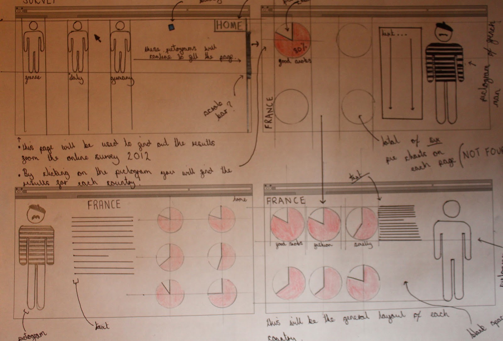
These examples above are the 2012 results. The results that are in my book. I like the idea above. The pictograms for each country will fill the page and which ever country you want to look at you simply click the pictogram and it will send you to the results. From these design sheets I have got a really good idea of where I want to go with my website, however, I know its going to be very hard to make a website! Its going to be hard to learn but it will defiantly be a skill worth having. I come away from these design sheets worrying about the colour of my summer project. They just aren't right and need to change them but I am really struggling with this. I guess I will have to spend I while trying to correct what is wrong. In all I am pleased with my drawings, I feel they give a good image of what my website will eventually look like. 

Thursday 25 October 2012

Typography Workshop TWO// Workshop & Task

What does Minion Pro say to me? 
What Product or brand WOULD it suit?
 What Product or brand WOULDN'T it suit?
..............................................................................................................................................

TASK : Find a proverb and play around with it in this structure TWO, FOUR, THREE, ONE.

I frislty went onto the internet to find a proverb, one that had four words in, I simply went onto google and found this website that had over 600 proverbs on - http://www.phrases.org.uk/meanings/proverbs.html


My chosen proverb is ALL THINGS MUST PASS.

From the Bible, Matthew 24:6-8 (King James Version):
And ye shall hear of wars and rumours of wars: see that ye be not troubled: for all these things must come to pass, but the end is not yet.
For nation shall rise against nation, and kingdom against kingdom: and there shall be famines, and pestilences, and earthquakes, in divers places.
All these are the beginning of sorrows. - http://www.phrases.org.uk/meanings/29200.html
The only thing you can't do is add colour or use both caps or no caps, no use of bold or italic. Document must be portrait.


TWO, FOUR, THREE, ONE- Now to make it read ONE, TWO, THREE, FOUR.


Just for the record, I have decided to use Helvetica as my font- and my font size is 48pt.
Below is what we decided during our group workshop work the best. I find it works well too, however are there any other ways it might work?


In the ones below I have tried to bring the words together to see what effect that has. My eyes are still brought towards 'ALL' as that is the only word facing the right way 


..................................................................


..................................................................


..................................................................

I think this one works quite well as you do follow ONE, TWO THREE FOUR. I will go on to use this technique further.
..................................................................


..................................................................


I find 'MUST' is really difficult to read. Its actually becoming hard for me anyway! Because I know the proverb quite well as I have been working with it for half an hour I will always read 'ALL THINGS MUST PAST'. As that is what I am looking for, for someone who doesn't know it however, that would be much different. I have an idea, but I need volunteers. If someone can get it straight away, that will be the correct way to have these words in the custom formation.


Wednesday 24 October 2012

Design for Web// Workshop TWO

During this workshop we had to firstly, identify what was most important on your homepage, and then create a thumbnail for what you would want your own personal design website to look like.


Website Thumbnail


Feed back from Group

  • I like the shape of the boxes and how they pop out when hovered over. I don't like the Bio & CV on homepage though. An image of some sort would draw the target audience in. Looks quite retro, would the background be graph paper? That would look good
  • The idea of one page and several pullouts is quite interesting, But i think it might be irritating for some users having to scroll if there is a lot of information taking up one smaller space.
  • Really like the navigation buttons as they will draw attention. Don't think that you should have your CV on the first page as that is giving to much information to the audience to quickly. I think it would be good to have imagery and the page for athletics. 
  • About page could be called home page. Multiple scroll bars may be confusing on held hand devices. Overall I think the simple and clean layout works.
  • I like the idea of the tabs that pull out at the side of the page. Slightly more interactive than the normal page. Is there anything on the homepage screen before the tabs have been clicked? photo? could look messy if new pages open on top. Good colour scheme of blue white and black.
  • Interactive tabs are a good idea. No need for two scroll bars. Logo might be too close to tabs once opened.
  • Interesting. Interactive feel with slipping out bits. Clear navigation. would the 'about' tab be open when you first open the site. OR would it just be a blank page? 
Overall I am happy with the comments as their negative feedback I received I was expecting. After doing this workshop I am really excited to get going and creating a website. I am worried however as how well I will learn everything as its something I have never done and I feel it will take a while to sink in! 

Design for Web// Workshop ONE


Simon firstly did a quick exercise to get out brains in action. He had a selection of websites lined up and within the first few seconds of viewing it, we had to shout out words that most suited that website. 

Olly Moss - ollymoss
  • 'Black'
  • 'Dull'
  • 'I like it'
  • 'Empty' 
  • 'Boring'
Mailika Favre - malikafavre
  • 'lipstick'
  • 'Hectic' 
  • 'Nipple'
  • 'Busy'
  • 'Colourful' 
360 Langstrasse Zurich - 360langstrasse
  • 'German' 
  • 'Sausage...?'
  • 'Google Maps' 
  • 'Photo'
  • 'Full on'
Mercertavern - mercertavern
  • 'Hipster'
  • 'Clean'
  • 'Fresh'
  • 'Black & White'
  • 'Boxes' 
Noble Design - nobledesign
  • 'Vector'
  • 'Girly'
  • 'Sharp'
  • 'Clean'
Caava Design - caavadesign
  • 'Cd'
  • 'Photoshop'
  • 'Hipster'
  • 'Bold'
  • 'Photo'
  • 'Circle'
When on Olly Moss's website, once clicking on one of the links to the website completely changed. Simon says that the website design should be simple, its the content that should really make the websiteOne of the corrent trends in webdesign is having a full bleed photo image as the background, not sure if this is a good trend at the moment. We then went on to show websites as a group, a volunteer would go to the front and type in a website we liked and our job was to shout out words that popped into our head. To be able to create these websites, we have to ask ourselves 3 QUESTIONS :
  • What is the purpose of this website?
  • Who is the target audience?
  • What do the target audience need?
How can we go about getting the answers to these? 
  • SURVEYS are always the best way to get TARGET AUDIENCE feedback. Very similar to people on the streets wanting you to take part in a Focus Group. This has to be the most effective way of getting raw feedback from an audeince or indeed you target audience. 
  • Look at similar websites that have the same target audience. This is probably the best way to answer these 'questions'
The three main things in a website are : 
  • Images 
  • Vectors 
  • Navigation
The important thing is the respect the rules, make sure your website shows the audience what its trying to sell, make sure you show them the purpose . Make it conventional, not unconventional. 

There are four main limitations to websites :
  • Fonts (Web fonts or Standard fonts) - YOU HAVE TO PAY to use fonts such as Helvetica if you intend to make money from your website. 99% of the time, a font you have on your website won't appear on the users browser because that font isn't installed on their computer. UN-STANDARD FONTS mean you can avoid this problem, this just follows the family of serifs of sans serifs. WEBKIT- You have to pay a license though if you install a font on to your website
  • Colour- RGB. Next session we will start making a website, and its all to do with code, even the colour is a code. There is a very limited range of colours on the website. 
  • Size - Screens are all different but you have standard web sized that you have to follow. Back way back when computer pages were the same size so you didn't really have to worry about how your website looked on other computers. Today however, we have to I-phone, I-pad etc which have a massive difference in screen size, the new mission is to create a website that can work on a variation of screens.
  • PPI (Resolution) -72% PPI is correct, but not correct, but is correct. Where has this number come from? All apple make screen had 72 Pixels per inich. Today, screens have 92% PER INCH. Retina display is high HD. So what do we do to make sure our website works? You can design different websites to suit different screens. MOBY : Mobile website (website on your mobile...)
The Language
  • HTML ( HYPER TEXT MARKUP LANGUAGE
  • URL (UNIFORM RESOURCE LOCATOR)
  • CSS (CASCADING STYLE SHEETS- an add on to HTML)
  • FTP (FILE TRANSFER PROTOCOL)
  • CMS (CONTENT MANAGEMENT SYSTEM)
  • WYSIWYG (WHAT YOU SEE IS WHAT YOU GET) 
Below is a quick diagram I made from a group decisions to the dimensions of the website will will end up creating. TASK FOR NEXT WEEK: Make a mock up of your website (paper and pen) do 10.


Tuesday 23 October 2012

Print Workshops ONE & TWO// Stock Workshop

Stock Workshop with Amber.

Firstly we had to look around for some interesting types of stock outside of college and cut them in to square 10cm x 10cm. Here are my examples: I ended up bringing some pretty boring stocks to the workshop but it was ok as we didn't look at them! Instead, Amber brought out a box full of varius publications with lovely different types of stock. Firstly, here are some examples of 


Pan 100 Finished film role. I think its a sticker that has been wrapped round the plastic.


Crosby, Stills, Nash & Young : Deja Vu original press Record. This is really interesting because when closely expecting, the text and photo look like they have been done hand made, The photo espically. The stock used is fascinating, feels like a sort of leather.


The Hola book is what you expecting from any book or publication presenting photos, I nice think glossy page


This a Leeds College of Art book made from a thick card 


Leaflet


Leaflet


Leaflet- The top three I all managed to find at the same time after a gig but they seem to all use the same stock. Maybe because it is cheap.


Skate Wheel, this is really old so the graphics have almost complelty gone, however I would like to look into how graphics are printed onto wheel.


Leaflet, the colours come out really nice on this leaflet, the paper is quite firm and glossy.
 ............................................................................................................................................................
Ambers second task- Collect a variety of stock and cut them into the dimensions 10cm, x 10cm


What I decided to choose wasn't exactly that exciting, especially when I came in to find all the examples Amber brought in. What I did try to do, was identify how my examples had been printed, but it was pretty much impossible without the microscope. I never knew so much attention could go into what sort of stock you could you and I never new there was so many different types out there. I look forward to getting some designs finished and looking into what stocks would work best or look nicest.

Photos from workshop 


I really enjoyed this workshop as we were shown a large range of different stock across a wide range of publications. I mostly like the examples that have been embossed and that is defiantly something I want to look into. I talked to a third year who was showing a friend his new business cards and he said that he went down to Vernon Street (Leeds) where is is quite easy to do such things. How you execute a final design is always so important as it can make such a difference to what the audience thinks about you (when talking about business cards). Embossed work adds so much more class to a design, and of course, a lot more attention