Wednesday, 20 February 2013

Studio Workshop THREE// Things I Don't Know// What is Good// What is Bad


Things I don't know about packaging.
  • How to get a glossy gold finish 
  • How to nicely fold a thick stock with out damaging it.
  • How to perfectly cut thick paper.
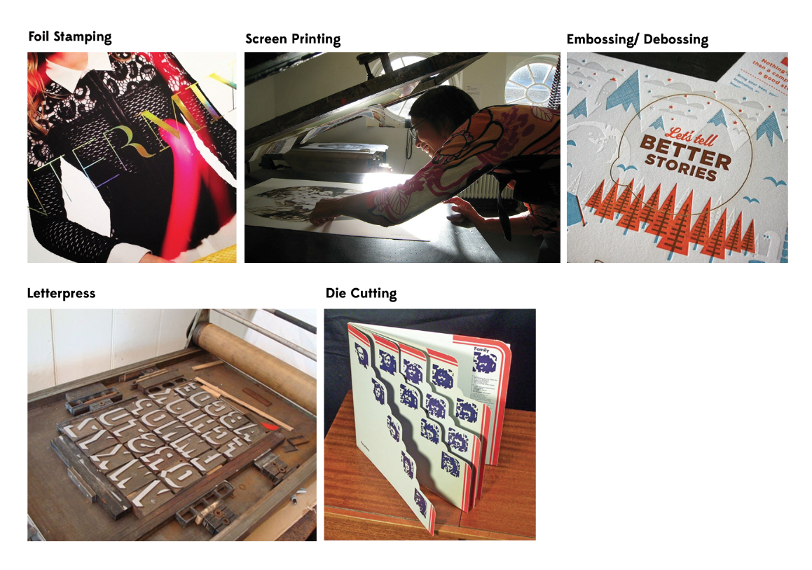
Things I don't know but need to find out about Print Processing. 
  • Foiling, can easily find out where to do it in the college though.
  • Die cutting.
  • Where to go to perfectly emboss and de-boss.
  • Where to go to print and fold thick stock.
  • How much printing will cost if I have to go out side of the college to print.
  • How to print a shinny, glossy spot colour. 
Reasons why chosen piece of packaging is rubbish. ( PACO RABANNE)
  • Colours and general look appear to be very expensive and would only appeal to an middle class, wealthy audience. 
  • The packaging is quite flimsy and could buckle under pressure, its not reliable. You could solve this by printing onto a bolder stock.
Reasons this packaging is good. ( PACO RABANNE)
  • Very nice to look at, visually pleasing.
  • Embossing makes the product seem more expensive and professional.
  • The colours connote wealth and success and I imagine is a very good selling point. 
  • Packaging is very easy to open.
  • Packaging is a good shape in terms of storage and size.
  • Font used is readable and simple. 
TASK For Next Week. A History of.....CAMPING.
  • A collection.
  • An intro to 
  • Things you need to know about.
  • An exhibition of.
For tuesday, create 5 presentaion board outlining my good, my range of good, the formats I will like to use, and the process I would like to use to communicate. This research will come very handy for the 16 page booklet. On Tuesday we will also be writing out brief.

PUBLICATION INSTEAD OF PACKAGING? 

Tuesday, 19 February 2013

Studio Workshop THREE// Logos & Products

 Firstly, this new bit of information I found out about : "Trade dress is a legal term of art that generally refers to characteristics of the visual appearance of a product or its packaging (or even the design of a building) that signify the source of the product to consumers.Trade dress is a form of intellectual property.'' - wikipedia
GROUPS BROUGHT IN PRODCUTS 

Think about:
  • Target Audience. 
  • How people interact.
  • Stock.
  • Special Production

Magazine : Hypebeast
  • Glossy stock.
  • Audience can intereact with the photography and the image.
  • Would find it in high end fashion shops.
Clothing Tag 
  • Been die cut.
  • Would be found in clothes stores 
  • Stock is a heavy card. Some gloss used too.
  • Audience will interact by looking at price and information about this product.
Oasis Tag
  • Been die cut
  • Made from a durable stock so is hard wearing, won't fit easily.
  • Stock is also quite glossy, possible been laminated.
Shoe box for Oasics
  • Hard stock so it is hard wearing.
  • Easily can be transported.
  • Easy to open and use contents inside.
  • Most importantly its cheap and reusable. 
  • Its venerable.
  • Box has been die cut and die stamped.

Chanel Business Card
  • Card has been embossed.
  • Printed on a nice textured, thick stock.
  • Audience will be high end successful people. 
  • Conventional shape to fit in pocket, wallet etc
  • Would be found at fashion shows ect.
  • Easy to store
Top Shop Makeup Flyer
  • Audience, female and trendy, people interested in fashion.
  • High street.
  • Would be found in store or in a magazine.
  • Student pack, freshers fair. 
  • You can read it, take advice from it, put it on your wall. 
  • Cheap stock Process put it has got foiling. 
Richard James Invitation 
  • Very thick stock, makes it seem expensive and professional.
  • Been printed with a stock colour
  • Text had been de-bossed slightly.
Topshop handout/ Promotional 
  • For customers and a young female audience 
  • Would be found in store, freshers fairs.
  • Dj Sets.
  • Could be found through the post. 
  • Read it to find out about what it is selling.
  • Pin it up on your wall. 
  • Stock is a nice grainy cheap card. 
  • It has been foiled, and die cut. 
Label for jeans 
  • Found on the item, found in Topshop.
  • People read it to find out size and cleaning instructions
  • Stock is a transparent, fabric that is sturdy and not likely to break. 
  • It has also been stitched.
  • We all agree it has been printed very cheaply. 
Label for Moto
  • Found on products from Moto.
  • Stock is a off white card, sturdy, not likely to rip or break. 
Jewellery Packaging
  • Found in store and can be posted.
  • Easy to open. 
  • Can be de-constructed.
  • Stock is a textured, thick card.
  • Net seem quite complicated.
  • Easily opened to get to whats inside. 
  • Been die cut, stamped and sticked.
Card Holder
  • Found in people housed, on a desk 
  • Found in card shops and craft fairs, exhibitions.
  • People interact by placing their card on it.
  • Fun and playful product.
  • Stock is a strong card so it can stand up and support cards
  • Stock looks foiled but is just a glossy card.
  • Has been die cut.
Book
  • Find it in a book shop, in your home, in a office, in a deign studio.
  • People read it and can rip pages out to stick up.
  • Can be scanned in.
  • A lot of imagery through out the book so an easy read and can be easily understood.
  • The front has been embossed.
  • The book has been perfectly bound with glue.
Post Card Holder
  • Would be found in craft shops. 
  • Flat so can be easily stored and transported. 
  • Can be interacted by being opened and closed. Cards can be easily stored.
  • Stock is a simple card, looks very similar to card board.
  • Gives the idea it is environmentally friendly. 
A4 Folder
  • Found in stationary shop, offices, schools, studios.
  • Good for organisation of documents.
  • Easy to carry and store. 
  • Stock is a simple brown card. Very durable, not likely to damage easily.
  • Spot Varnish. Die cut. Flat Pack.

Photography Workshop


During this workshop in the Photography department we were taken through thoroughly the basics of a Canon DLR camera. We looked at Aperture (F stop), Shutter speed and ISO and how they must be adjusted to different enviroments. We all brought in different objects we could photograph and we were able to swap them around with the group. I decided to use three different lenses. The basic 18-55 mm lens which is good for all aspects of photography. The wide angle lens which is slightly similar to the fish eye, this lens means you can fit much more into your shot (good example is the photo I took of the group and the studio). And, finally I used the Marco lens which was the funnest to use. With this lens you could get extreme close ups of the object. If you take a look at the photos I took of the trainers you we see what I mean! This has been good practise I now know where to go when I want to take highly professional photos of the work and products I have produced.

Monday, 18 February 2013

Responsive// Ted Baker Collaboration Label ONE// Design MENS


Random gold colour, not a fan. I do want to experiment with gradients though. 


This black and silver I got the idea from Polo as it looked perfect. It's hard to know what the colour will really look like untill it has been printed out so I'm not too sure how to go about this! This design is not at all finished. It is still missing something, maybe I have to find another illustration or pattern to go with it to make it feel more complete. I have also put my label so far into context and it looks wrong, The colours are too rich and strong for the bottle, I can't quite explain what I mean but it doesn't look right! 
I need to go back to the drawing board and look into colour. 


Thursday, 14 February 2013

Responsive// Workshop ONE// Ted Baker Collaborative

At least TEN things we agree on with our chosen Brief.

  • The concept for the brief.
  • The Audience that we want to target.
  • The product range we want to distribute. 
  • The message and image we want to portray.  
  • The specific roles we are going to be doing.
  • The overall costings for any materials.
  • The country we want to target in relation to the brief.
  • What stock we intend to print on.
  • Our ability to effectively communicate our thoughts and ideas together
  • Similar interests in approaching a brief and creating an extensive product range in all types of media.
  • How we want our work to look like in context, photography etc. 
Positive differences we have.
  • Knowledgable experience of different software such as Illustrator. 
  • Different experience of finishing and printing. 
  • Different knowledge of design techniques. 
Problems we could face during this brief.
  • Time spent together, finding the time to work on the brief.
  • Design decisions.
  • Ethical/ Political Moral differences. 
  • Having to spend time on other briefs.
Benefits of working in a pair. 
  • Better thought process.
  • Different view points.
  • More ideas on the board. 
  • More work can be achieved in a short amount of time. 
  • Wider range or skills like printing and finishing, software programs etc.
  • Learning from each other. 
  • Shared costs and resources.
  • Professional Integrity. 
  • Improve communication skills. 

Responsive// Ted Baker// Finding our Perfume Bottles


We decided that we wanted to go with this Chanel look with our product and amazingly we managed to find two bottles on ebay! The item has 4 more days left on it which means if we win (and we will) we will have the bottles by this time next week which is great news. The only worry is this look is very iconic or channel but when the bottle has been rebranded with Ted Baker i'm sure it will have a great effect. I contacted the ebayer and she said that the stickers can be completely removed to leave a blank bottle which is JUST what we want. Nigel has been looking into ways a packaging out bottle and later together we will look into nets for out main packaging. We will have to wait for the bottles to arrive before we can work out the measurements. 

Wednesday, 13 February 2013

Responsive// Ted Baker Collaboration

Brief

Introduce Ted Baker to a country of your choice.

Creative challenge

Ted Baker is continuing its plan for global growth, with new locations opening in China, Japan, the USA and the Middle East – each time taking a little bit of Britain with them.
When opening a new location in another country, it’s not easy for a brand like Ted to translate its unique cultural flavour. It’s your job to bring its British sense of humour and unique approach to fashion to another country – which country is up to you.
Your campaign will need to activate potential shoppers to visit Ted Baker stores and Ted Baker online; interact with the brand; and most importantly to shop and share.

................................................................................................................................................

Why have you chosen to work with your creative partner? What are your aims?

I have chosen to work with Nigel because we share a similar interest in the things we want to accomplish this term. Our main aims are to create a branding ad campaign that will appeal to a different country in a different city. Other aims include using the college facilities to seek out different ways of finishing and printing. 

What are your specific areas of creative interest in this brief?

Our main interest in this brief is to make a British theme work and in the end become recognised and liked in a different city of our choice. We will have to consider style, colour and what representation we will use to make Ted Baker appeal to our audience. I am interested to what city we decide to go with as the city we chose could end up effecting the design of our product etc.

What specific design skills do you have to offer in relation to your chosen brief? How do you intend to use them? 

In terms of design skills we both know what needs to be done in making Ted Baker appeal to our chosen audeince. By giving the campaign and English theme we will know how to design for our audience. We both have a reasonably good understanding of Photoshop, Illustrator etc so we will be able to execute our work to a professional standard. In terms of commitment to the work and time management we are on the ball and will put the hard work in. 

What specific non-design skills do you have to offer in relation to your chosen brief. How do you intend to use them?


What will your specific roles be in collaboration in relation to the brief?

This is something we will work out later in the brief as at the moment we are brain storming ideas and working out what needs doing. I think in all hough we will be responsible for the same things. We want to make sure that we put the same amount of effort in each. When it comes to the final stages of the brief I think thats when we will split up and seek printing techniques etc. 

What will your individual responsibilitied be in relation to you breif? 

This question relates to the last one, This is something I feel we will decide as the brief goes on. Its to early to condider what we will each be doing but I feel when it comes to the final touched in producing out product we will sperate.


Style capitals of the world. What will most suit us though?