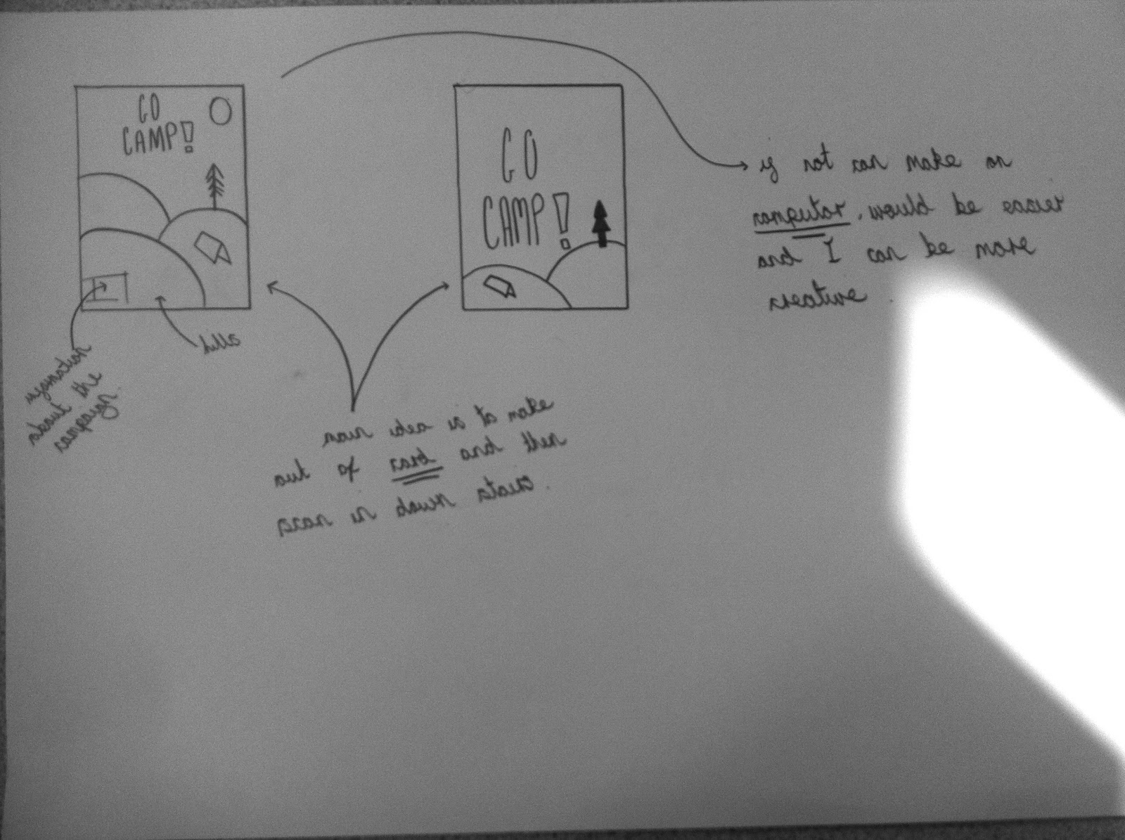


Apart from all the fonts clearly being from Lost Type.com, I am pleased with this outcome. I was inspired by the design on my design context blog to use card but then I decided to keep the card style and do it on illustrator. This design really makes camping look appealing and it gives a nice look at what Britain can look like in the summer time. My job now is to locate places I can put this poster into context.


Heres just one example of what the poster would look like in context. I managed to find this photo on google images and decided to use it because of the trees in the back ground. The poster fits perfectly with its surroundings. One thing I have just noticed is you can have an exclamation mark in an
an IP address so I've had to go back and take it out of all my work which has been a bit of a drag.
No comments:
Post a Comment