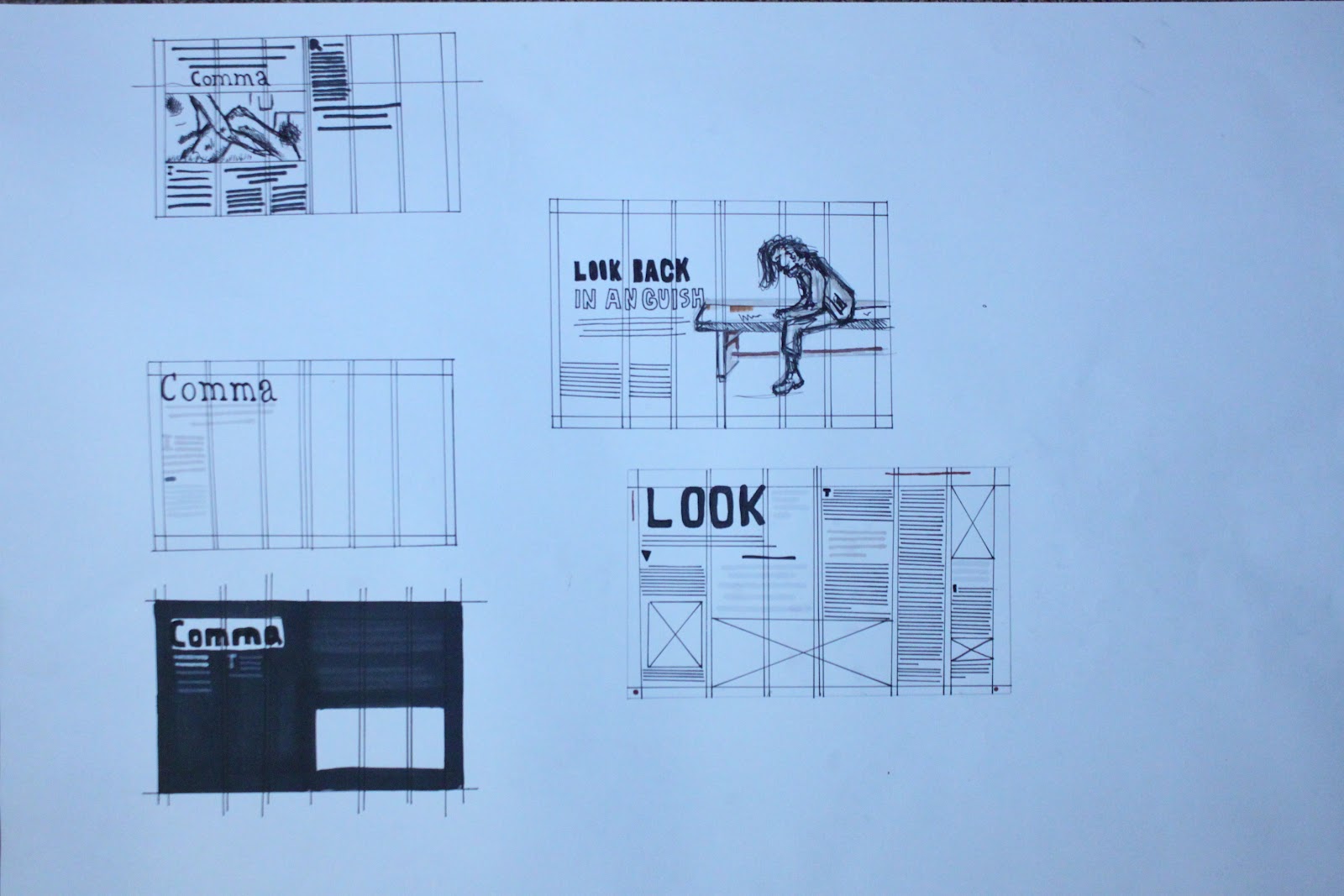


Well I have learned that I am pretty terrible at thumbnails which is a disapointment. From the ideas I have generated I can't say I have anything interesting to work with or anything I want to run with. I have started to look through magazines I like the layout of and using that as inspiration to boost my confidence. You can see I am going with a 6 column page so that I can try and be creative. However I quite like the idea of having quite a simple but fresh looking page. The sort of page you would find in a magazine like Grafik or a similar publication to that. I have found out that I am not the sort of person who is in to filling a page with information to a point where you really have to dig in to get information . I like the idea of having a clear and legible layout which also looks good.

Layout to work with

................................................................................................................................


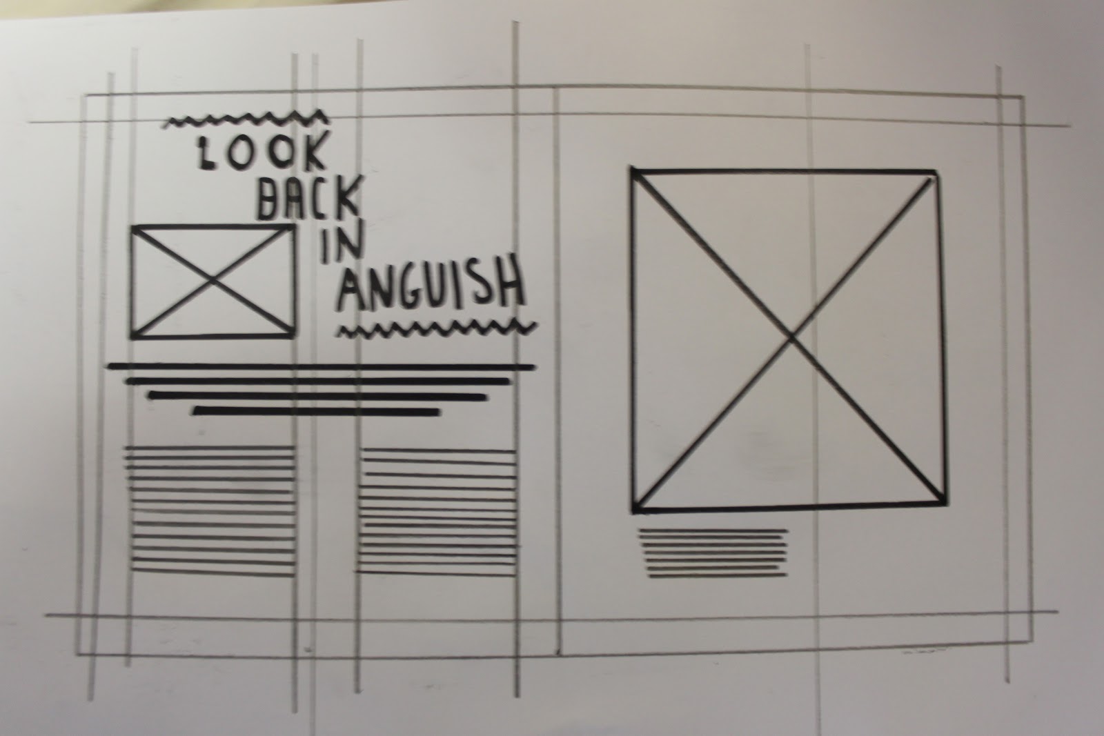
Because I am now going to go with this one above as my grid I feel that my final outcome will indeed be very simple with little next. There is a big image and little text to give you a stronger idea of the article and what/who's is about.
These double page spreads act as more of a front cover than anything. Getting you ready and making you fully aware or a long article. I am going to see what I can come up with. The grid on this double page spread is very odd. instead of the columns lying perfectly they overlap meaning there is a column going through the middle from one page to the other.


Condering that my double page spread that I used as reference is about Samantha Morton I decided to use her as the context. Here is my first mock up/ attempt of making an article and it doesn't look right. Maybe with text it would look nice. One problem I am having is the picture and how pixulated it is. I have looked through my notes from the lecture and I can't see to find anything about placing a file properly. Thats something I need to look up on. I bet that I can find something on the internet. I find myself running away from the design sheets and simply playing around on indesign. Its a different story as design sheet only give you a vague idea of what you design will look like.


Decided to stop with this one. I want to have a photo as the whole of the back ground but with this photo it just won't work at all with the text.
+10.jpg)

Using the clone tool and the smudge tool I have been able to make this portrait photograph of Samantha in to a double page spread. When you zoom in you can see how tacky it is so I am going top spend a while editing it so its perfect before moving into indesign. I've decided not to use that background! It is too obvious that I have used the clone tool. I am quite unhappy about that as its a very nice photograph.


Not a fan of the black. Black has a way of giving a wrong sense of meaning. I decided to blog it as it did actually look quite nice. This final outcome is very simple but I feel that it works wonderfully. Its the sort of article I could imagine to be in a a magazine like the sunday times (apart from the background would be yellowish due to the stock it would be printed on) I have experimented with different layouts and different photos of samantha.
One thing I feel need to improve on massively are my thumbnails because they are shocking. Lorenzo made a point that our thumbnails must give a strong idea of what we might want to design once on Indesign. My drawing skills gave somewhat gone since A-level somehow! I deiced to change article to the more simple 3 grid page. That helped me to think better as the grid I originally went with was way to busy and I found it hard to work with anything.
No comments:
Post a Comment