Thursday, 29 September 2011

Alphabet Soup

All of these Letters I made on black and white card. I would draw on top of the card lightly and then with a cutting knife, carefully cut. To finish them off I scanned them into photoshop where I only made the colours darker. The actual letters are 15cmx15cm. The word I was responding to was "STRETCH". In my sketchbook I did lots of different examples until I had a good idea of how I could stretch the letter "R". All in all I didn't use a lot of reference with the particular project. It was quite easy to jot ideas on scrap pieces of paper and then go along with one I liked. All of the letters have a similar and simple look to them. Thats what I wanted. To end up with a nice group of 10 letters that weren't over the top and said the word "Stretch"


Upper Case R. During the holidays when we had to collect different materials  I came across this card

Lower Case R. Reminds me of the typical bubble writing

Upper Case R. I like this one as it really responds the 'Stretch'

Upper Case R. I think this one could be more exaggerated but it still works. 

My Reference on my Design Context helped me with this particular letter.

The 'Memoriam' typeface helped me create this one

Lowercase R


Upper case R. Against a white background its quite hard to see the letter.

Upper Case R

Again using the idea of the letter going out of the square. Helps give the idea that the letter is bring stretched 


Work sheet one, We had to make 10 examples as quickly as possible, This was a good warm up. 


Some sketch book work 

Close up


1. To lengthen, widen, or distend: stretched the sweater out of shape.

2. To cause to extend from one place to another or across a given space: stretched the banner between two poles.

3. To make taut; tighten: stretched the tarpaulin until it ripped.

4. To reach or put forth; extend: stretched out his hand.

5.
a. To extend (oneself or one's limbs, for example) to full length: stretched her calves before running.
b. To extend (oneself) when lying down: she stretched herself out on the couch.
c. To put to torture on the rack.

6. To wrench or strain (a muscle, for example).

7.
a. To extend or enlarge beyond the usual or proper limits: stretch the meaning of a word.
b. To subject to undue strain: to stretch one's patience.

8.
a. To expand in order to fulfill a larger function: stretch a budget; stretch a paycheck.
b. To increase the quantity of by admixture or dilution: stretch a meal by thinning the stew.

9. To prolong: stretch out an argument.

10. Informal To fell by a blow: stretched his opponent in the first round.


Thursday, 22 September 2011

Red Logo on a Brown Box


The outcome of this box is a lot stronger than the blue on white

Logo on box. Blue and Red on White


I roughly printed the logo out on the A4 paper. I managed to print about 8 on to one page. The box was made by Beth Hayden and Emily James who are also in my blog group. Its easy to say that the blue works a lot better on the white than the red. The next thing that we are doing is making a brown box with brown card with the red logo. We had a small meeting about the final box and we all agreed that a brown box would fit better as our reference was taken from the stereotypical Chinese takeaway box.

The Final logo (Not pixilated)

When you click to view full size its still a tiny bit blurry. However, when the logo is on the final box you will hardly notice it as it will appear a lot smaller than the full size image.

The Final Logo

Out of all the examples we have decided that this logo is the most conventional out of the lot. I feel that the colours of the other ones didn't really work with the idea.
We are now working on the box idea. What the box will look like. At the moment we are going with the stereotypical chinese takeaway boxes.

At the moment... this example is pixilated. At halls I have the actual file.

Other Colour Ideas.


I'm still a big fan of the baby blue after looking at these. The blue makes me think of 'aid'. Its a very calming colour. For example, apart from the purple, the colours here don't really suit the theme of the box.

New Logo Ideas.


As a group we decided to change the font of the logo and also delete the bubbles that were in the left hand corner. I ended up using 'Heiti TC' as the font and I think it looks much better now.

Wednesday, 21 September 2011

Mock Example - Logo on Box


The box and the photo is not mine. I simply found it on google images.
To look at other examples of the logo on box's follow this link to Sam Hoh's blog. -
http://s-hoh1114-dp.blogspot.com/

Survival Guide Logo Example 1.

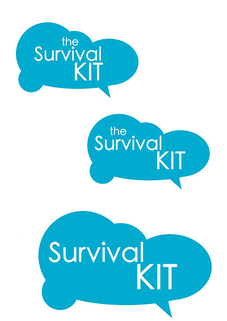
Survival KIT.


Here are my first logos for our Survival kit. I simply used the Elliptical marquee Tool on photoshop to get the bubble look. The Font used is Helvetica Neue, mostly 'Ultra Light'. I prefer the more simple look, for example the 2nd and 3rd logos on the page. 
Next I am going to find a plain box on the internet to play around with on photoshop, get a mock idea of what the logo will look like on packaging.

Tuesday, 20 September 2011

HOW TO : Manage a heavy workload. Mind Map


I am in Blog Group 8 and here is our mind map for 'How To'. Our idea is to create a Survival Box which will help you get through your hard work. We don't intend to put anything in the box, we just plan to create   the box itself. A name is not yet given but so far we have 'SBox' and 'Student Box'. The next stage is to gather useful reference that will inspire our final outcome

Monday, 19 September 2011

Alphabet: My Favourite Ten


A for Architecture 

B for Bicycle 

E for Equality 

H for Heights

P for Photography

R for Reading
I for Imaginative

T for Trees

U for Unite
D for Drawing


10 Alphabet Themes

1. Colour
2. Variations- Mostly different.
3. Subjects (Hobbies etc.)
4. Individual- As a whole our work is different .
5. Some are handmade
6. They all have a digital finish.
7. They are all personal
8. Mostly, as a set they are lower an higher case.
9. Image and type.
10. Likes and dislikes