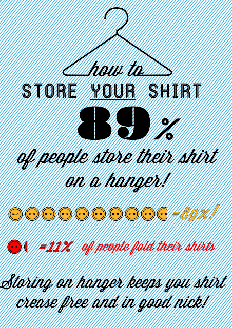
Tomorrow we have to have our booklet & our presentation finished. Everyone has almost finished their page and there is debate on weather to have 1 or 2 pages each in the booklet. Today I found out that its best we have a virtually blank background so that the graphics come through the tracing paper even nicer. Here are some designs I have done. As a group we will decide what one to put in. Legibility and communication is essential.
My first design is simple but I feel you get a good idea of how to store your shirt! I kept the stripy background as it made the page look more interesting I guess! It doesn't get in the way of the text anyway. The only problem with this is everybody else has a blank background so I guess I am going to have to change it.
OUR FINAL SIZE IS : 10 X 7 cm
Honestly I find this boring. I could ad some text at the bottom but I'm not a fan of the white background. I think that once it is printed onto tracing paper the overall look will look nice as the background will consist of other graphics coming thorough the paper. I feel this will make a big impact visually.
I have just realised that my information graphics is wrong! The buttons indicate 99%! NOT 89%! This must be changed right away.


